Calligraphy for St. Paul’s Cathedral in Kamloops

http://www.kamloopsthisweek.com/makeover-st-pauls-roll-honour/

Restoring this commemorative scroll might have been one of the most important lettering projects that I’ve encountered in thirty-five years of calligraphy. The size of the board (3 feet by 6 feet) added to the “bigness” of the project.  Thank you to St. Paul’s for an amazing experience.

Advertisement

Season’s Greetings, Hockey style

Renate Worthington "Oldtimers Tournament"“Old Cocks, Old Shots, even Old Flames
Who’s to say what’s in a name
Rusty Blades, Rusty Spurs,
Bombers, Blasters, Harriers,
Antiques, Model A’s, Model T’s
waitin’ for the ice to freeze…”

These few lines are part of the poem “Old-Timers Tournament” from Keith’s poetry book, After The Flood: Hockey Poems. Renate’s artwork is called a “calligram” and features the names of many old-timer hockey teams. The original size of the hockey player is 4 by 6 inches, and was drawn using several sizes of fine-tipped markers. Season’s greetings to all!


More Calligrams by Renate:

Carolingian-style letterforms

This style of calligraphy is a good choice for longer poems and quotations. It is vertical, therefore easier to read, and relates to present-day fonts, so is a familiar set of letters. Some calligraphers use the traditional heavier ascenders; I have chosen to keep them slim. Here are some examples where I have used my own particular adaptation of this style.

IMG_7897

ALBERTA BOUND -excerpt from lyrics by Paul Brandt,  lettering and boots by Renate. Another two versions of Alberta Bound is written in “Neuland” below.

(Practise chunk)


 Carolingian letters - Renate

Private commission lettered by Renate


IMG_0382

PRINCIPAL:  Words by Keith Worthington, lettering by Renate Worthington.


A MARKING OF TIME: poem by Keith, artwork and “Carolingian” lettering style by Renate.

P1110684

RINK IMAGINED- poem by Keith Worthington, from AFTER THE FLOOD: Hockey Poems ©2013,  lettered by Renate,

Medieval letters in a modern world

Image

It is the 21st century, but the appeal of Versal letters still attracts us. My students are on their last session of a six-week adventure into drawing, decorating, colouring and boxing in their letters. New forms emerged and have been re-purposed for cards, envelopes and special occasion words. Names were lettered with an artistic flair. Metallic pens  created magic on dark paper. The thrill of creating an original bit of art remains  in our fast-paced modern lives.  The artwork above was done by Renate with pointed nibs, gouache and ink on vellum. Each letter is about 3/4 of an inch in height.

Lettering styles

Tight Boots- calligraphy by Renate

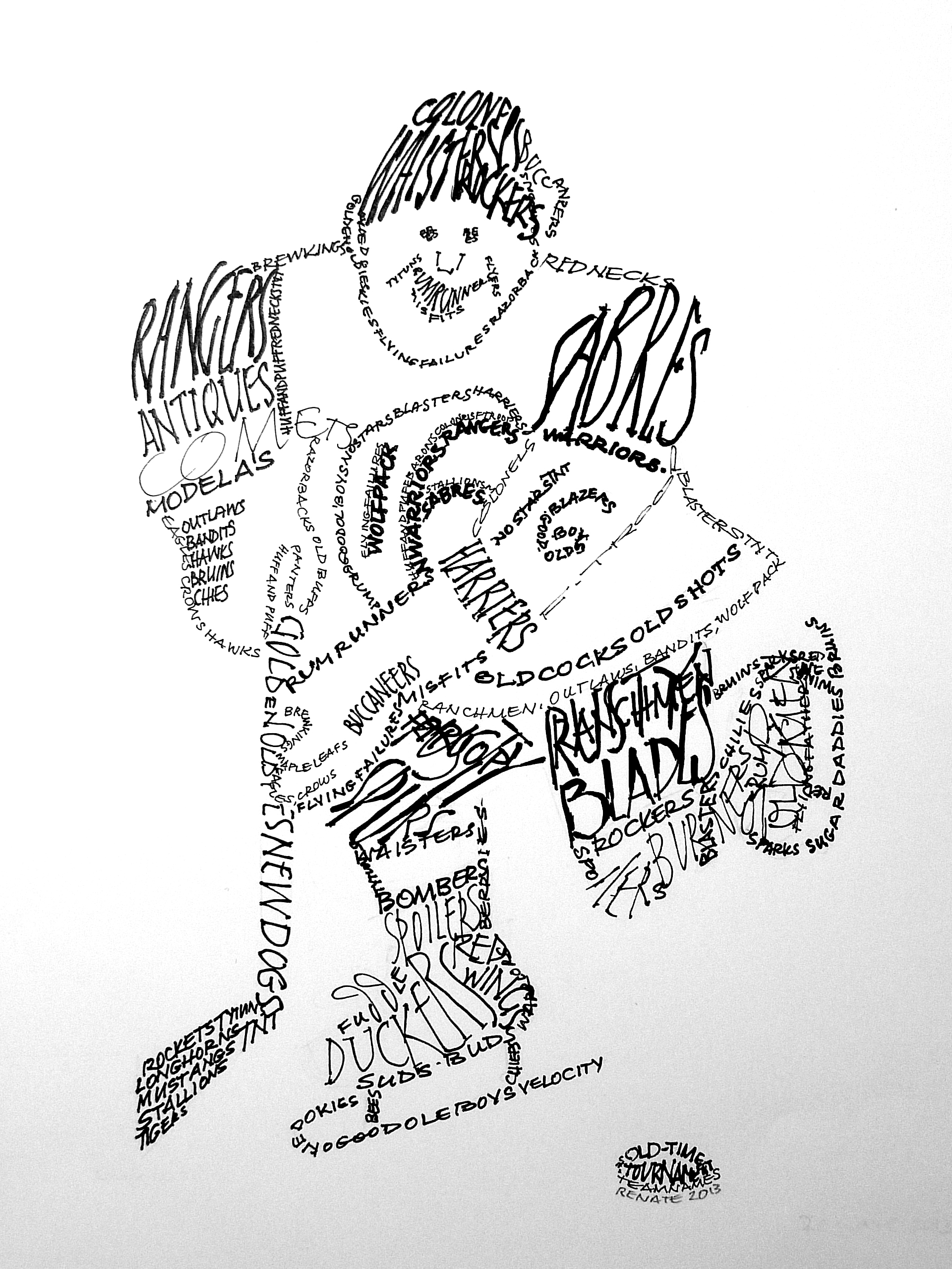
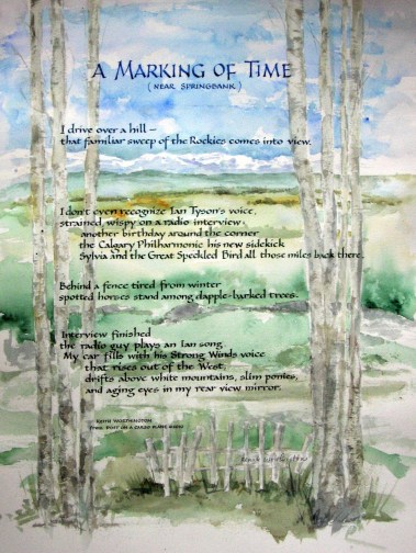
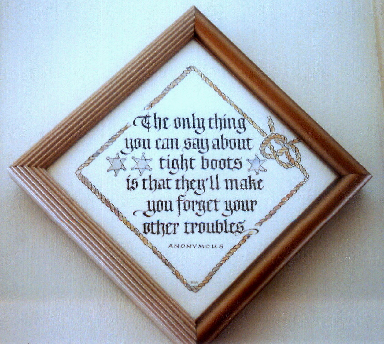
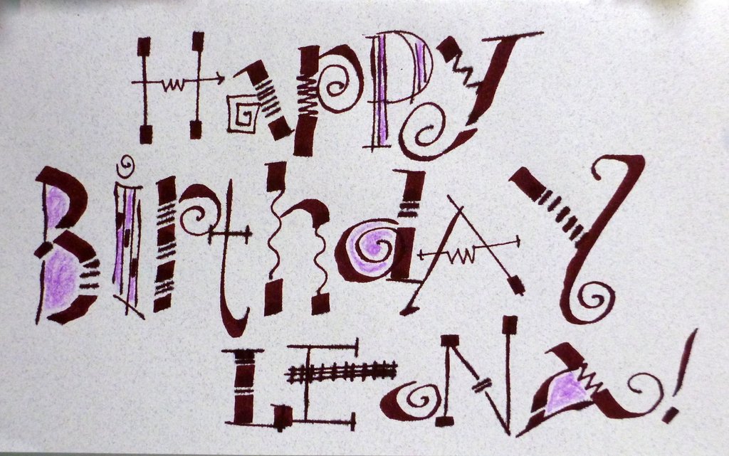
Blackletter (or Old English) often has a solemn purpose, but it seems to work for humorous Western quotes as well.

P1020482

Renate Worthington - Alberta Bound July 2012

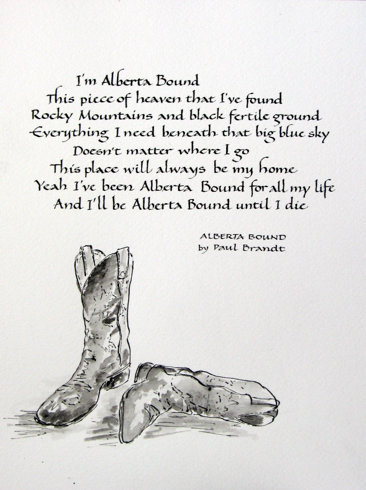
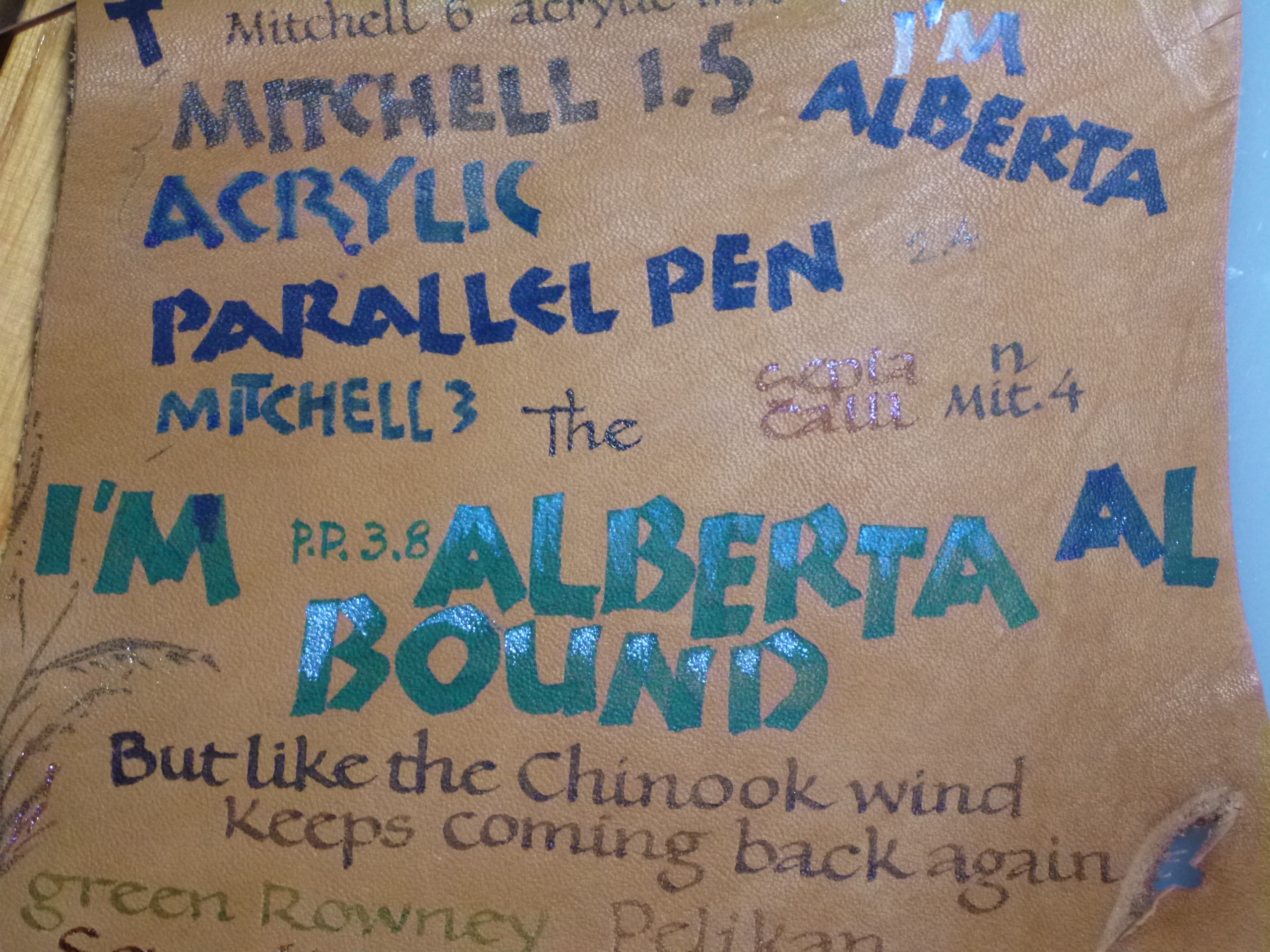
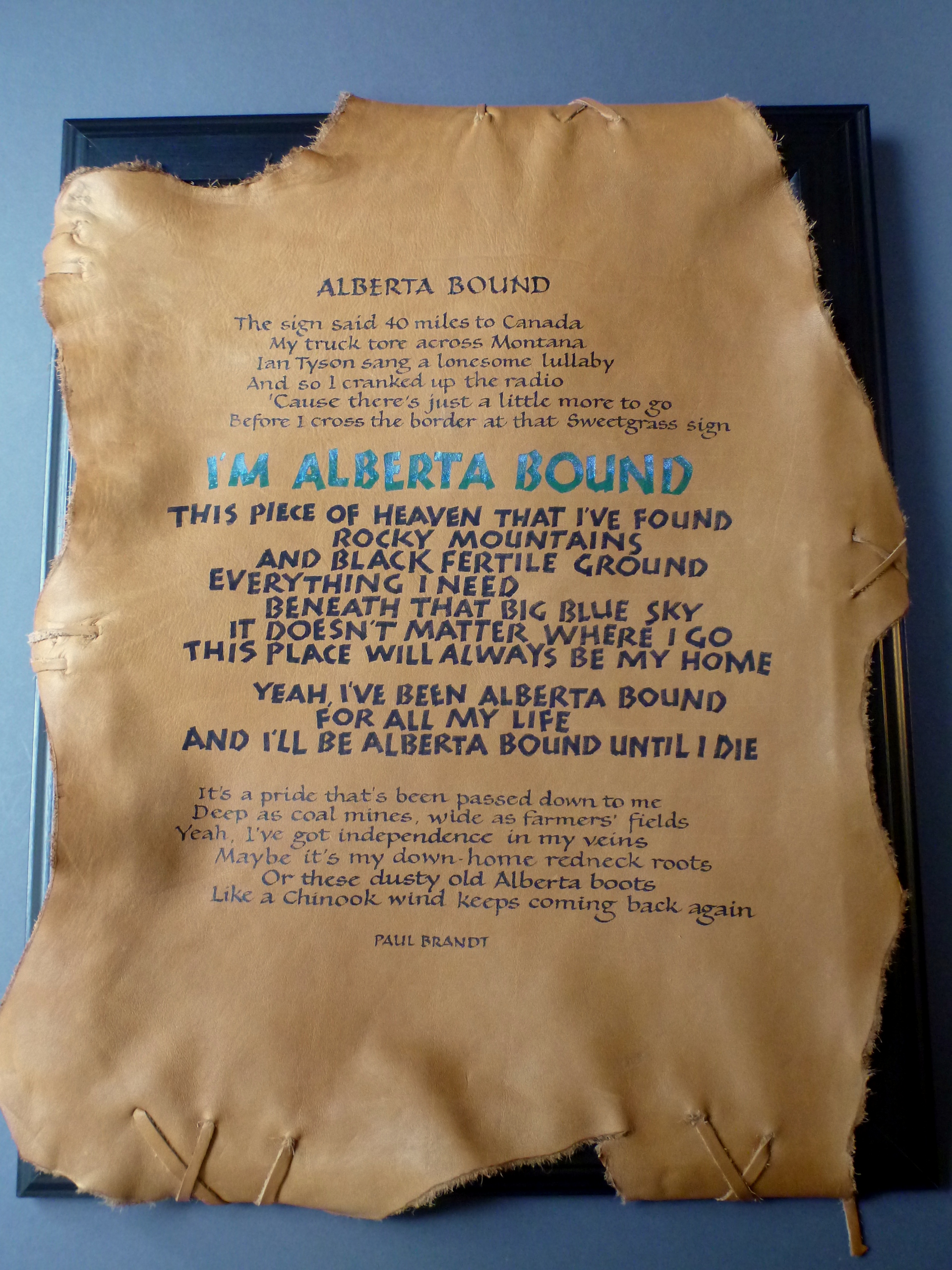
Above on the left is the test piece of leather and at right the final product for Paul Brandt’s lyrics to “Alberta Bound” which I lettered  for display (with Paul’s permission) at the 2013 Calgary Exhibition and Stampede’s Creative Showcase. The lettering styles are a combination of Neuland (the green and blue letters) and Bookhand (brown letters).

traditional pointed pen (Copperplate)- Renate Worthington

Angel's Landing - Copperplate script

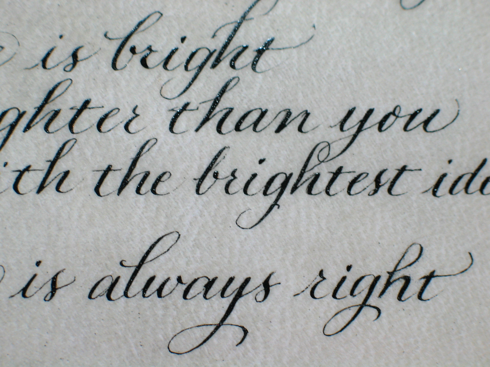
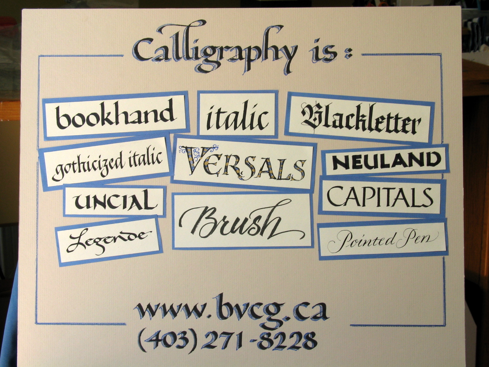
Pointed Pen lettering or “Copperplate”  uses a pointed nib, which creates thick and thin strokes depending on the pressure placed on the nib. This alphabet has an elegant Victorian feel.

P1070275 funky 2

The sample above is of the “Fun and Funky” lettering : it’s a fun way for beginners of calligraphy to use a chisel-edged pen and learn what pen angle changes can do. The Pilot Parallel Pens work on their chisel edges and on the corners to offer two tools in one.

Drawn Versal "O" & Bookhand lettering text - Renate

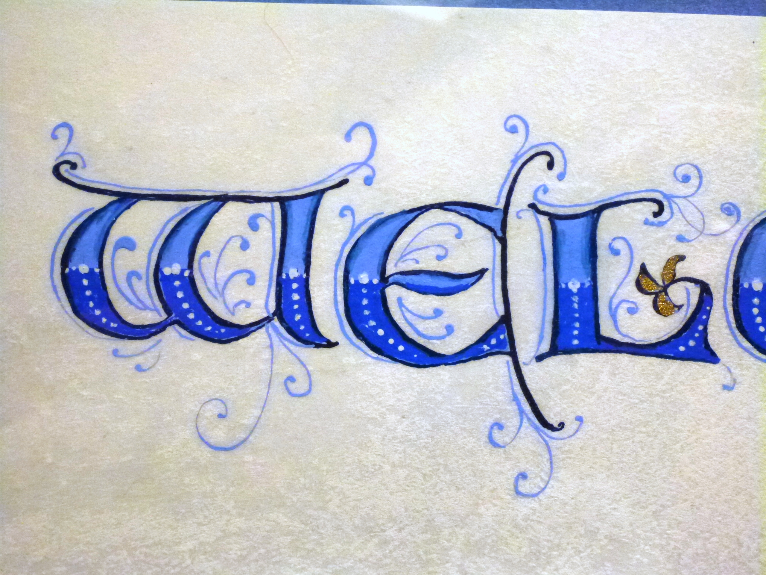
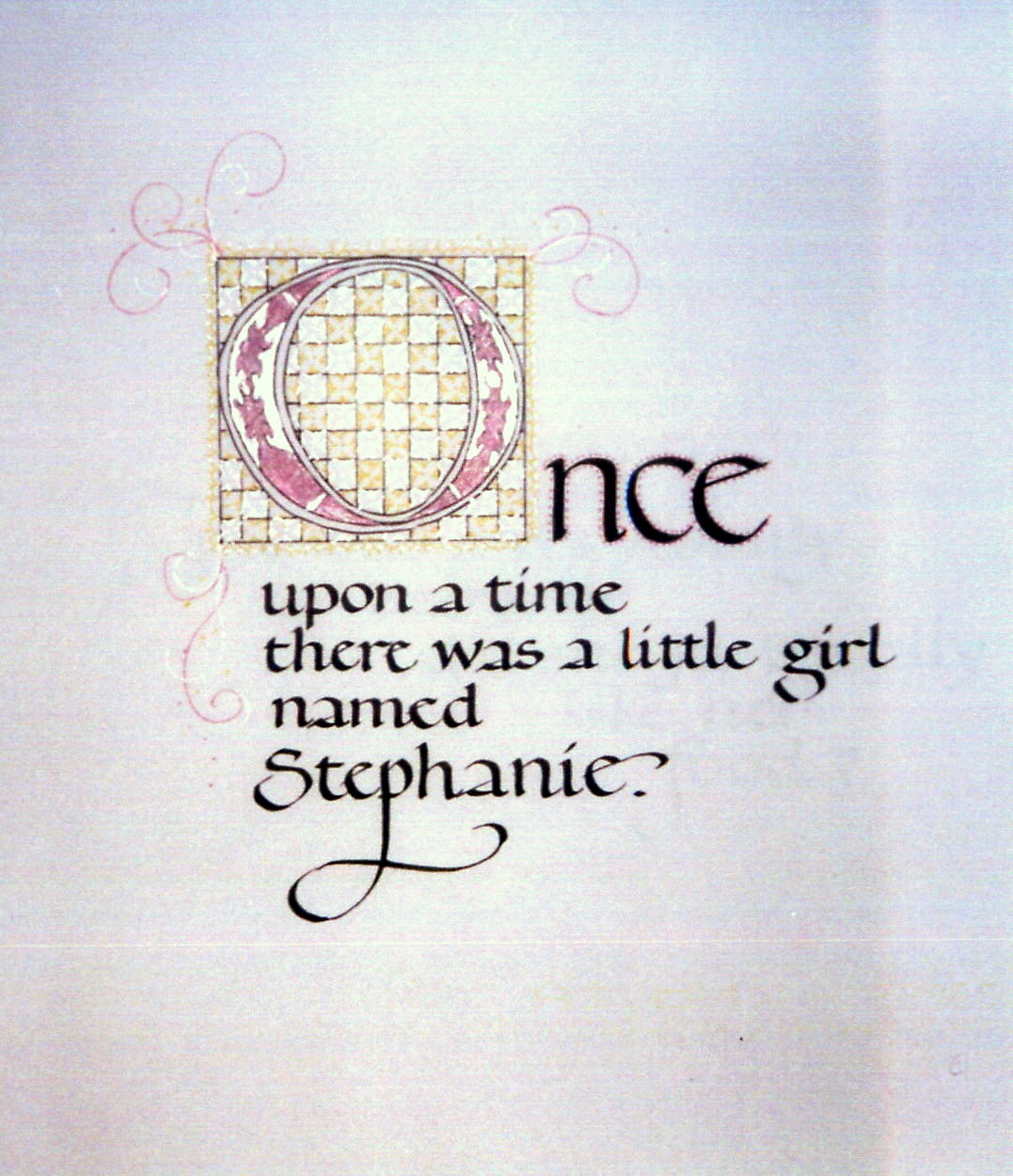
The “O” in “Once” is an example of a Versal capital, a drawn decorated letter that creates a focus on the first letter of a page or word. It is decorated with a silver and gold diapering (the small squares) pattern to continue with the “little girl” theme. The accompanying letter style shown in this piece is Bookhand.

Bow Valley Calligraphy Guild

BVCG Banner

Calligraphy demonstrations introduce the public to different styles. Here are some of the more common “hands” that you might see at a demo featuring calligraphers from the Bow Valley Calligraphy Guild. Our Guild is based in Calgary, meets monthly, puts out a great journal and continues to promote the love of letters. Check it out at http://www.bvcg.ca.

We had a fabulous response at our tables set up in Jubilee Auditorium during Alberta Ballet’s “Madame Butterfly”. Many customized bookmarks were given to patrons as a souvenir of our time at this beautiful venue.

Calligraphy is...