This style of calligraphy is a good choice for longer poems and quotations. It is easy to read, and relates to present-day fonts, so is a familiar set of letters. Here are some examples where I have used my own particular adaptation of this style.
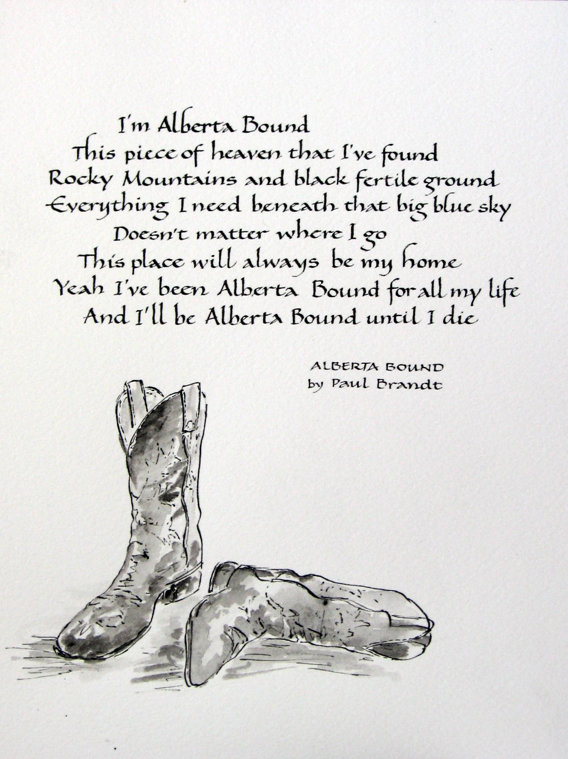
ALBERTA BOUND -excerpt from lyrics by Paul Brandt, lettering and boots by Renate. Another version of Alberta Bound is written in “Neuland” below.

Alberta Bound – Renate’s lettering, words by Paul Brandt

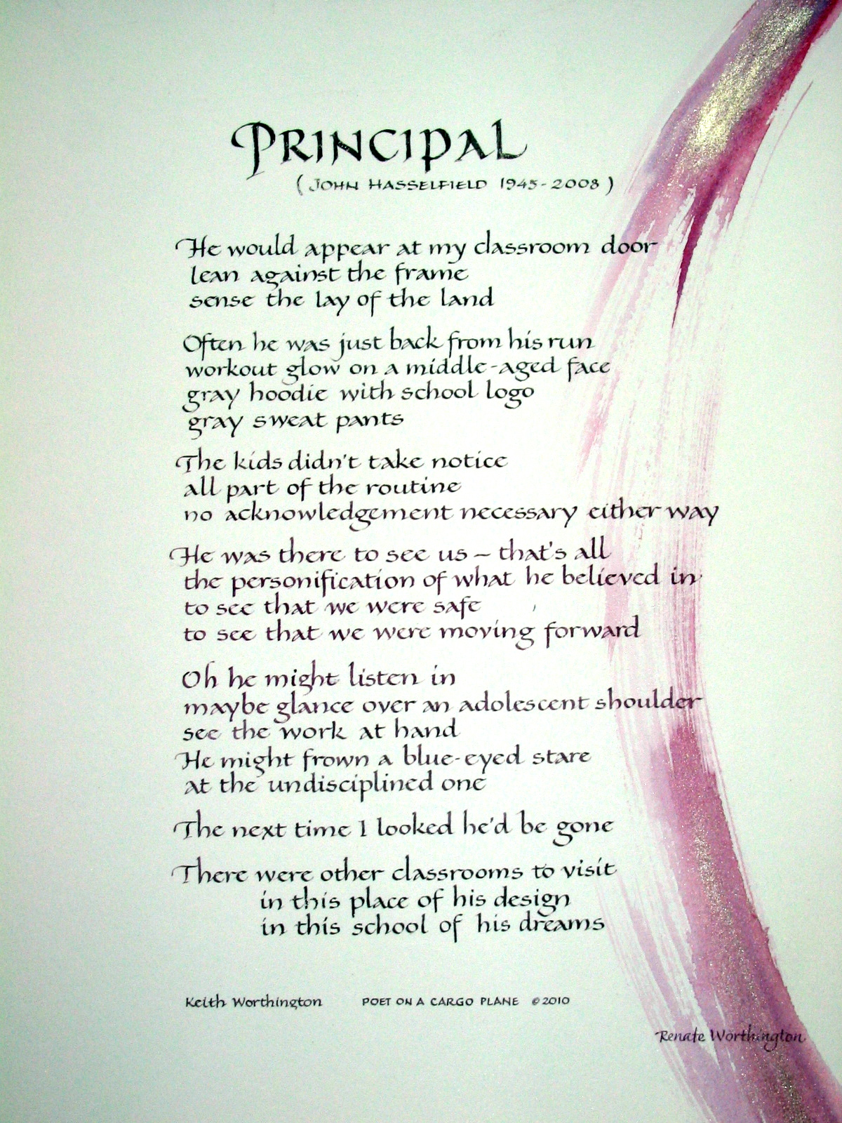
PRINCIPAL ( Keith Worthington)
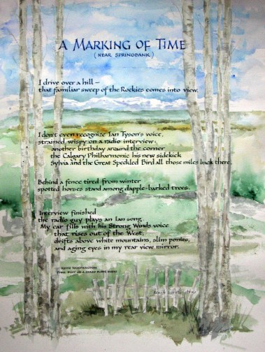
A MARKING OF TIME (Keith Worthington)
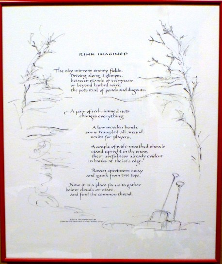
RINK IMAGINED (Keith Worthington)
