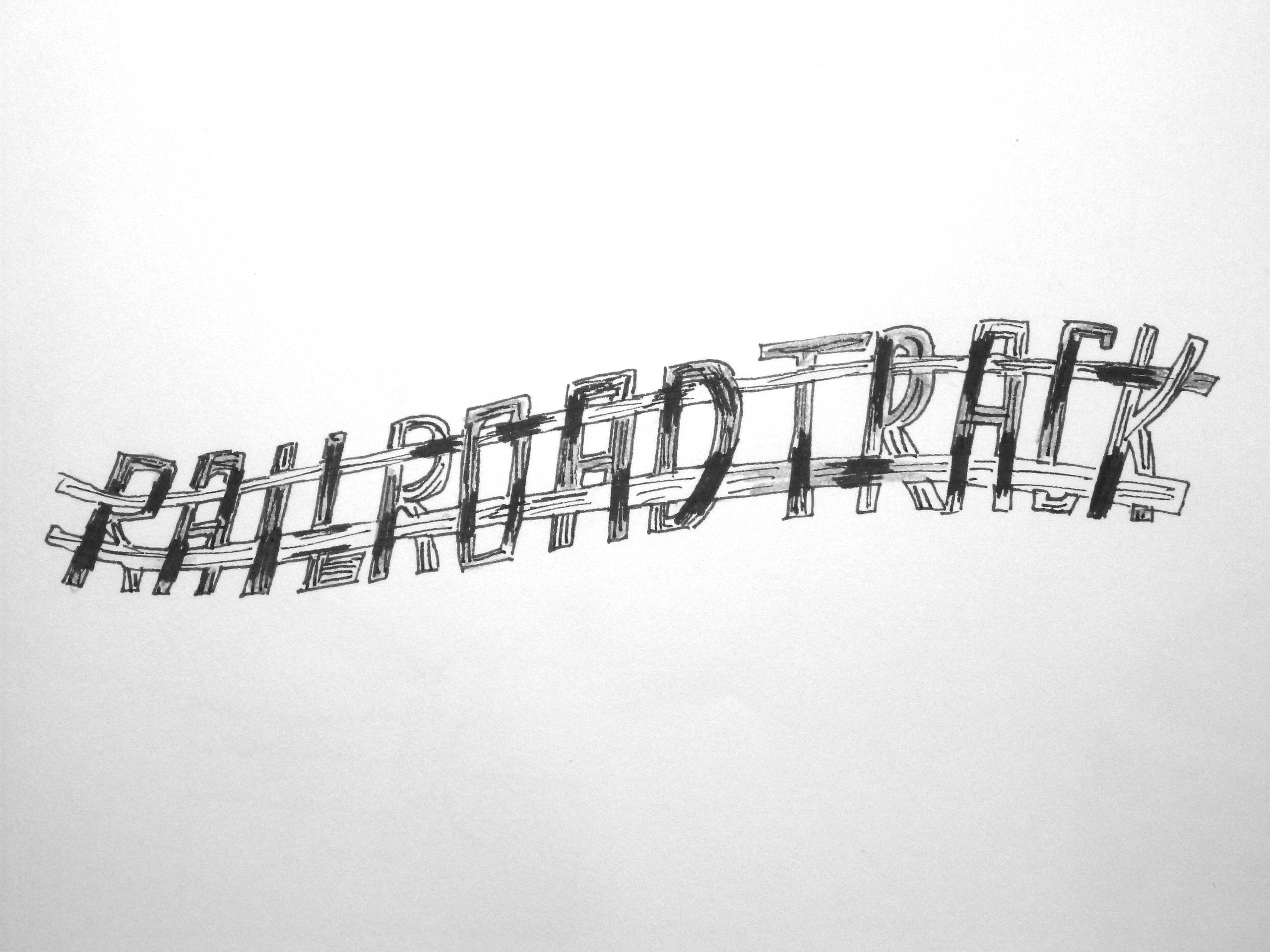
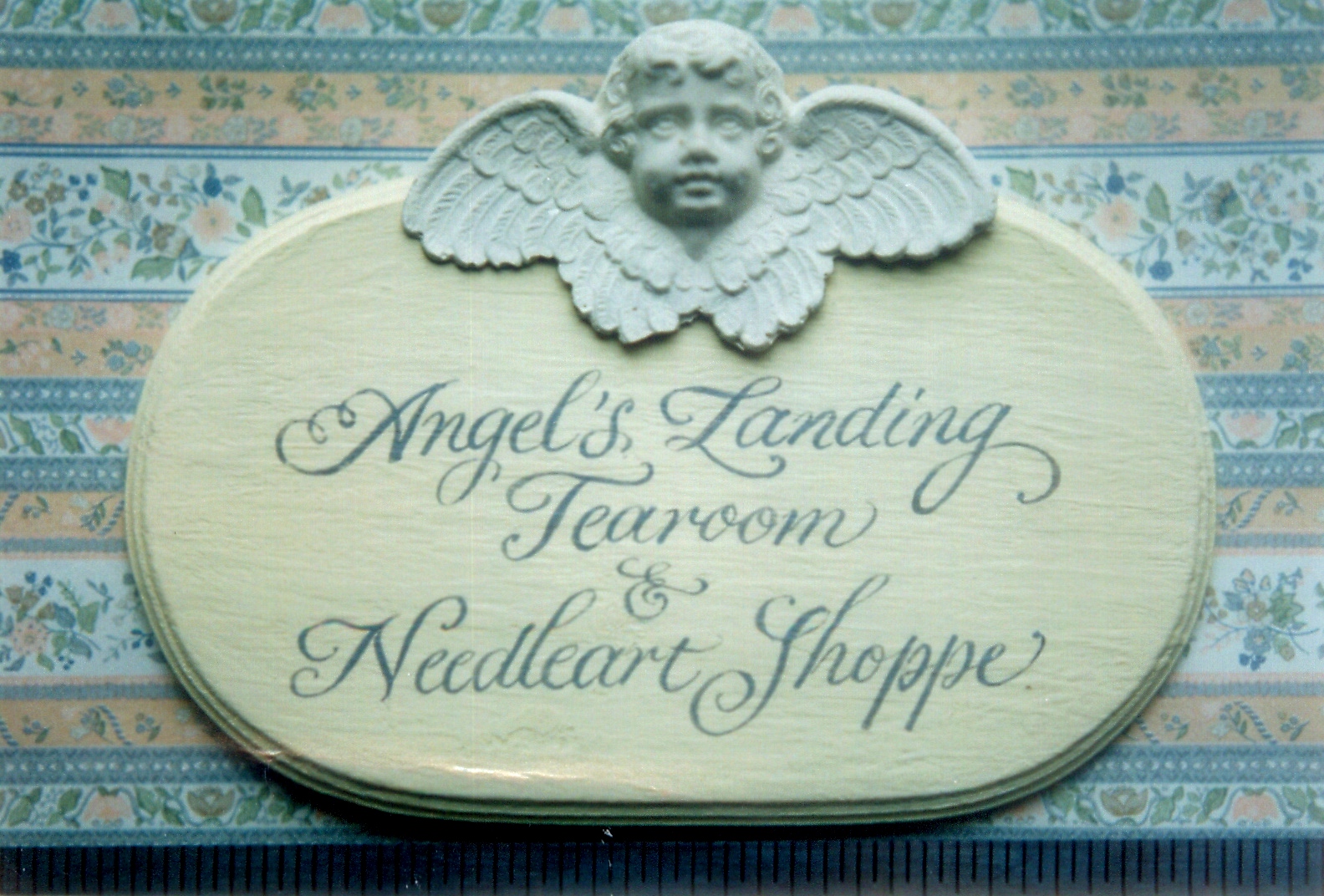
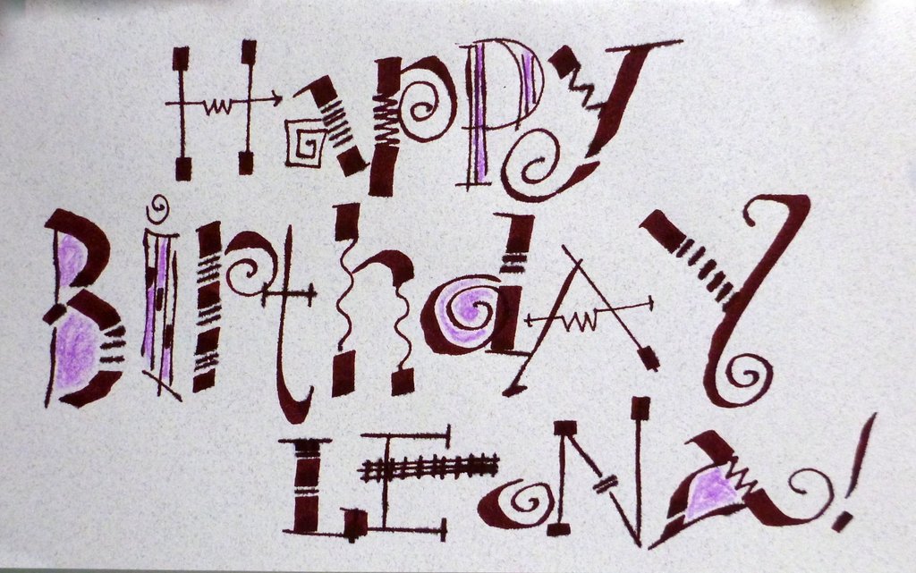
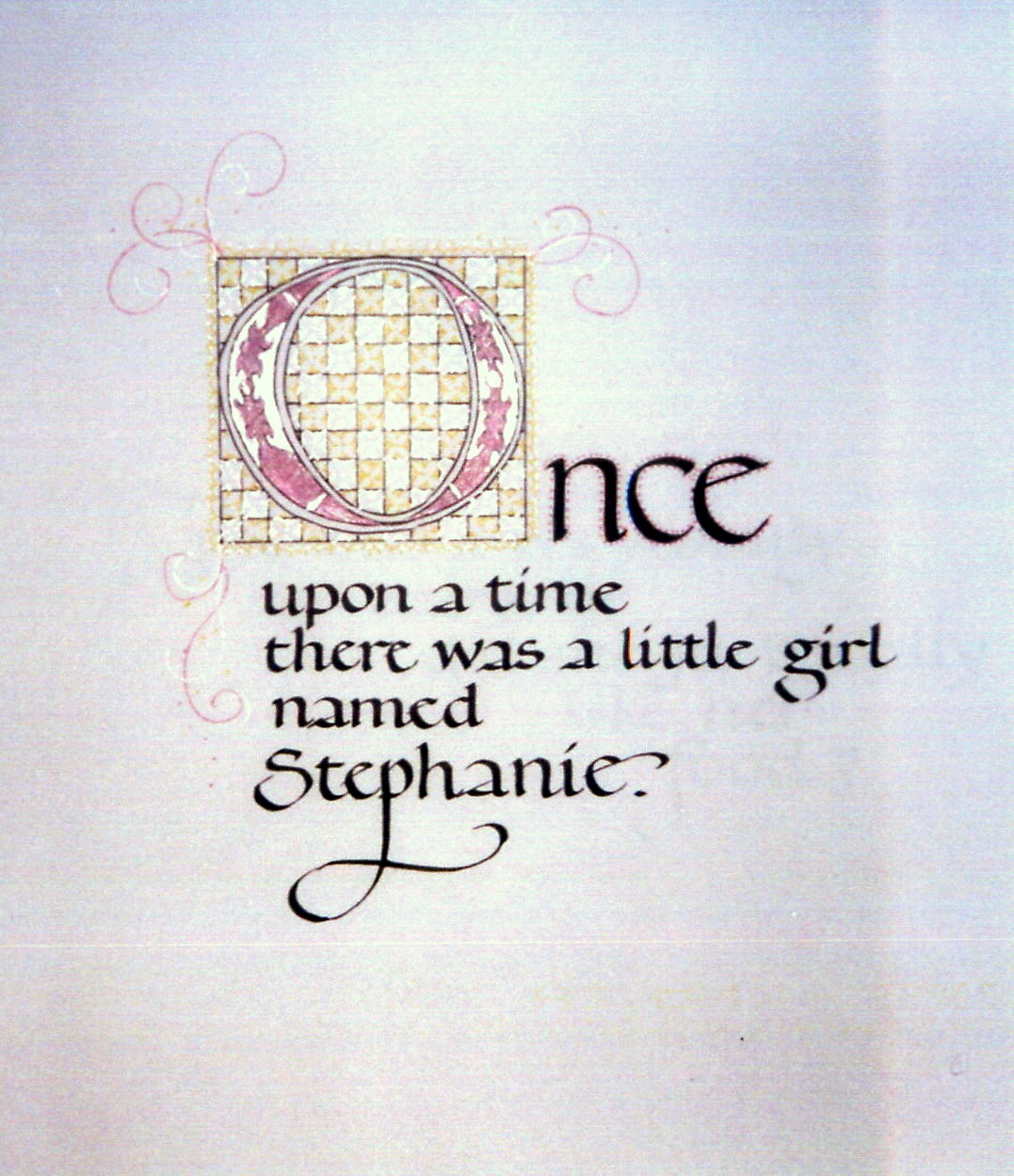
Capitals, either built-up or casual, make a clean, legible, strong impression. Here are several examples of our artwork featuring capital letterforms.

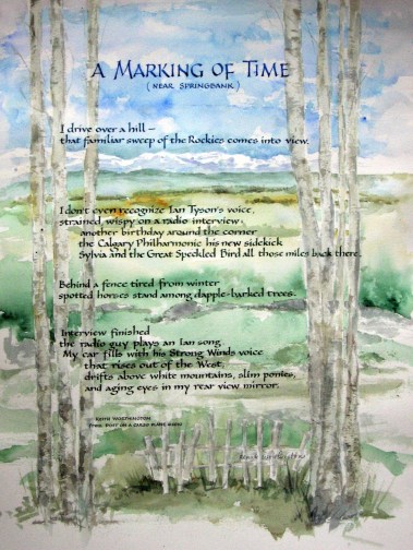
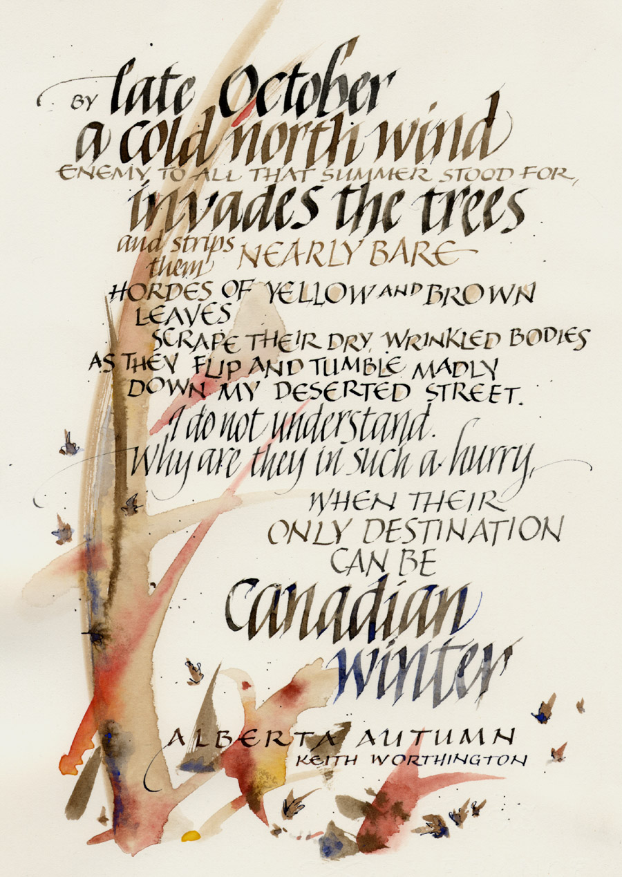
(Excerpt from THE SEASON SETTLES IN, by Keith Worthington. Renate’s letters are made by manipulating the nib angle of the Capitals.

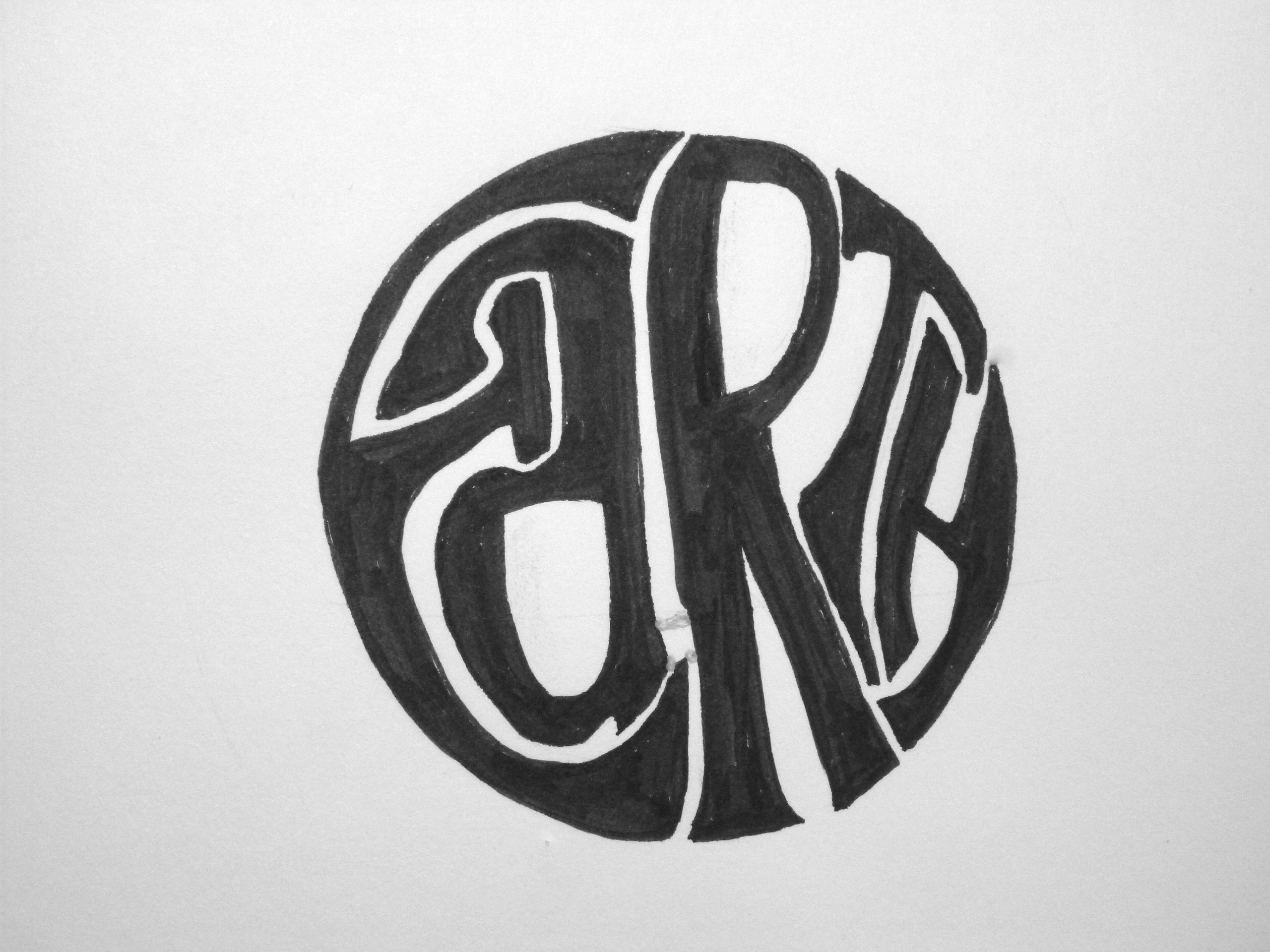
Capitals by Renate

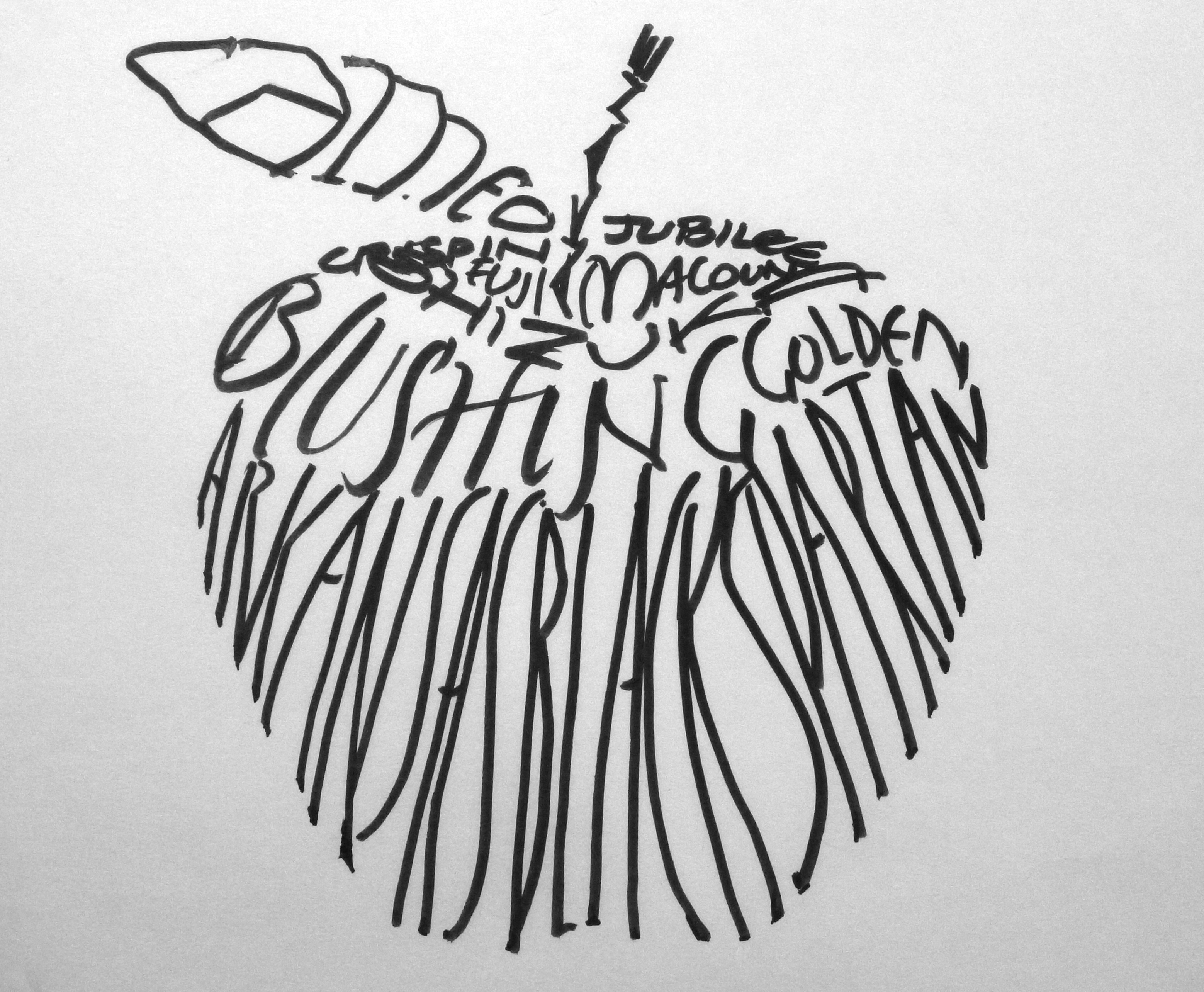
Apples of Gold – italic and capitals, lettered by Renate
Two examples of Proverbs 25:11, lettered in Capitals, Versal “A”, and Italic. The lettering in the Saint John’s Bible was my inspiration for these pieces.

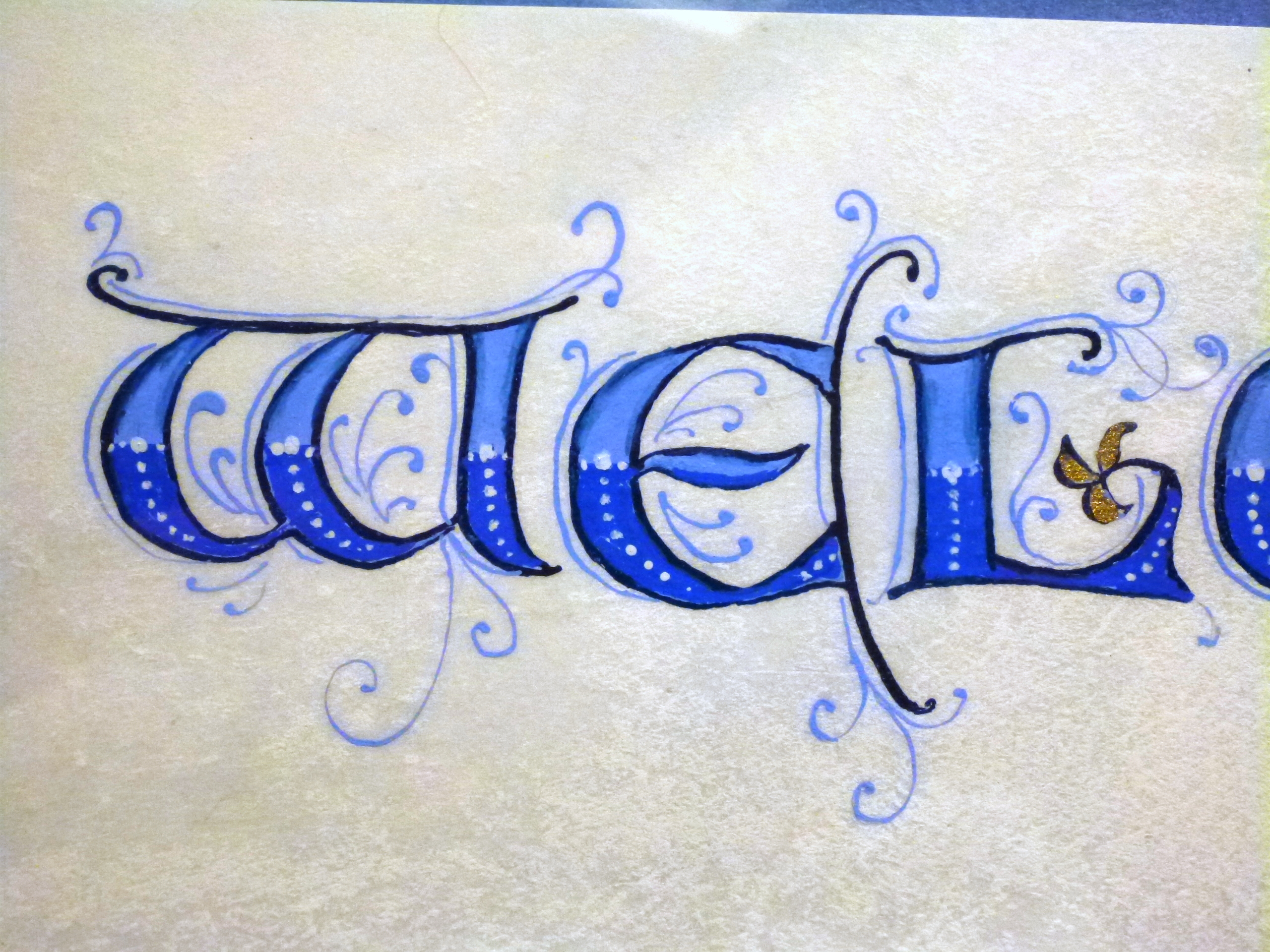
Growth: capitals and original words by Renate

Chockstone: Keith Worthington, built up capitals lettered by Renate
- GROWTH: Words and letters by Renate, are presented as a page in the Bow Valley Calligraphy Guild book celebrating one of the BVCG milestones.
CHOCKSTONE by Keith Worthington. Renate’s letters are built-up capitals penned on a translucent vellum overlaying the artwork.

WAITING FOR SNOW by Keith Worthington. Renate’s lettering is a mix of Italic letters and informal Capitals.