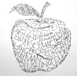
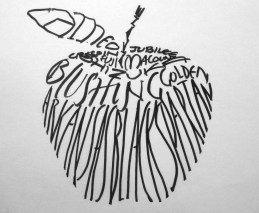
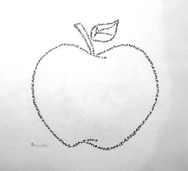
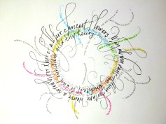
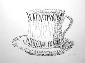
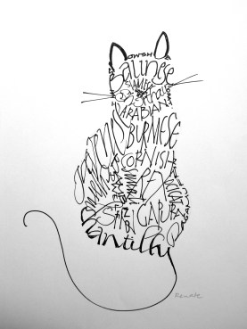
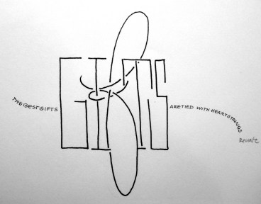
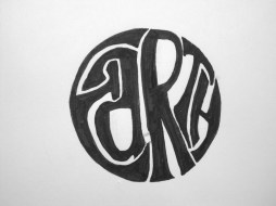
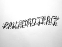
It has been decades since we created calligrams; time to play with these creations again. I drew and lettered these designs with fine point markers in a workshop presented by Annette Wichmann. Below are several examples of my in-class drawings. Check out the”hockey player” in the Season’s Greetings-Hockey style post.
Italic Lettering
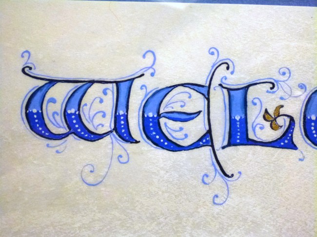
Medieval letters in a modern world
It is the 21st century, but the appeal of Versal letters still attracts us. My students are on their last session of a six-week adventure into drawing, decorating, colouring and boxing in their letters. New forms emerged and have been re-purposed for cards, envelopes and special occasion words. Names were lettered with an artistic flair. Metallic pens created magic on dark paper. The thrill of creating an original bit of art remains in our fast-paced modern lives. The artwork above was done by Renate with pointed nibs, gouache and ink on vellum. Each letter is about 3/4 of an inch in height.
Lettering styles
Blackletter (or Old English) often has a solemn purpose, but it seems to work for humorous Western quotes as well.
Above on the left is the test piece of leather and at right the final product for Paul Brandt’s lyrics to “Alberta Bound” which I lettered for display (with Paul’s permission) at the 2013 Calgary Exhibition and Stampede’s Creative Showcase. The lettering styles are a combination of Neuland (the green and blue letters) and Bookhand (brown letters).
Pointed Pen lettering or “Copperplate” uses a pointed nib, which creates thick and thin strokes depending on the pressure placed on the nib. This alphabet has an elegant Victorian feel.
The sample above is of the “Fun and Funky” lettering : it’s a fun way for beginners of calligraphy to use a chisel-edged pen and learn what pen angle changes can do. The Pilot Parallel Pens work on their chisel edges and on the corners to offer two tools in one.
The “O” in “Once” is an example of a Versal capital, a drawn decorated letter that creates a focus on the first letter of a page or word. It is decorated with a silver and gold diapering (the small squares) pattern to continue with the “little girl” theme. The accompanying letter style shown in this piece is Bookhand.
Bow Valley Calligraphy Guild
Calligraphy demonstrations introduce the public to different styles. Here are some of the more common “hands” that you might see at a demo featuring calligraphers from the Bow Valley Calligraphy Guild. Our Guild is based in Calgary, meets monthly, puts out a great journal and continues to promote the love of letters. Check it out at http://www.bvcg.ca.
We had a fabulous response at our tables set up in Jubilee Auditorium during Alberta Ballet’s “Madame Butterfly”. Many customized bookmarks were given to patrons as a souvenir of our time at this beautiful venue.
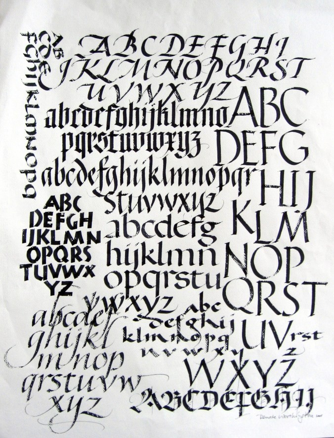
I wrote all the letters on this broadside with the same size tool: a 3.8 mm.Pilot Parallel Pen. One tool, one hand, many moods. The white flecks in the letters are a result of the ink gliding on just the surface of the textured paper.
Alphabets Poster
Pointed Brush lettering
 This Franz Kafka quotation and the flowers were both created with pointed brushes.
“Solstice” is one of Keith’s poems from PUFFS OF BREATH. I used a very large brush to indicate the background peony.
“Meadow Tree” is one of Keith’s poems from PUFFS OF BREATH. I painted the background and lettered the words with pointed brushes. This 20 by 20 inch stretched canvas was one of my submissions to the 2013 Creative Showcase at the Calgary Stampede & Exhibition.
Alberta Flood Rose Project
This wild rose is Renate’s contribution to the Alberta Flood Rose Project. Hundreds of artists took part in creating 4 by 4 inch representations of our provincial flower to symbolize hope for the future of many individuals and families impacted by the June floods. Read more about this amazing project at http://www.thealbertafloodroseproject.com.
